Dashboard Layout Framework
| Status | Authors | Coach | DRIs | Owning Stage | Created |
|---|---|---|---|---|---|
| ongoing |
rob.hunt
jiaan
|
ahegyi
|
lfarina8
nicholasklick
|
devops analytics | 2025-04-08 |
Table of Contents
- Summary
- Motivation
- Proposal
- Design and implementation details
- Getting started
- Migrating existing dashboards
Summary
Dashboards are at the heart of how our customers interact with their data. It is the means by which they are able to understand their data and use it to meet their business needs.
However, at GitLab, our dashboards have always been inherently feature-focused, without clear UX guidance or common UI framework instructing how to build a dashboard. The result is an inconsistent user experience across GitLab for customers. Additionally for development teams, there is no way to easily exchange or reuse existing dashboards, resulting in increased development time and maintenance cost.
~“group::platform insights” is leading the design, development, and implementation of the unified dashboard vision at GitLab. This vision began with the Dashboards Working Group and in March 2023 culminated in a new Pajamas dashboards pattern that laid the groundwork for what a dashboard is.
Since then, ~“group::platform insights” has developed an initial dashboards framework for the analytics feature space. This was built off the initial work for Product Analytics. The framework has been adopted by ~“group::optimize” for the Value Stream Dashboard and AI Impact Analytics, as well as currently being developed for our Security Dashboards.
The next stage of this work is to solidify the foundations of the dashboards framework, align on the UI/UX, and what features the dashboards framework will support. There must be clear guidance on:
- What a dashboard is and isn’t, along with what functionality a dashboard should provide.
- How to use the dashboards framework within existing features and new features.
- What guidelines should be followed when using the dashboards framework.
- How to contribute to the dashboards framework and the wider dashboards UI/UX.
Motivation
As part of the Data Unification and Insights effort, we are looking to unify and standardize our data offering at GitLab. A core part of this work is aligning our UI/UX to how customers interact with their data and gain insights on what they can do to meet their business needs. Implementing and adopting a standardized dashboards framework will go a long way to meeting this need, whilst also giving us the foundation to augment our existing offering with clearer visuals and AI integration.
Goals
- Clear guidelines on what constitutes a dashboard layout, what functionality it contains, and how to use the framework.
- Outline a clear migration path for existing dashboards.
- Adopt the dashboards framework across GitLab, especially where data is being used for analysis.
- An agnostic dashboards framework, not tied to any one feature, giving engineers the tools needed to quickly and efficiently set up and use dashboards.
- Link uses of the dashboards framework together in preparation for dashboards navigation restructuring.
Non-Goals
- ~“group::platform insights” will not implement every possible piece of functionality, data source, visualization type, or dashboard. These will be driven by feature teams, with support from ~“group::platform insights”.
- The dashboard layout framework does not include data exploration outside defined panel visualizations.
- The dashboard layout framework does not include user-driven customization of dashboards, only the building blocks of the dashboards themselves.
- The dashboard layout framework does not define where the dashboard should be placed in the navigation.
Proposal
With the above goals and motivation in mind, we want to outline a dashboard layout framework that provides the core functionality, UI, and UX needed to efficiently develop a dashboard within GitLab that adheres to our Pajamas guidelines. The structure outlined below describes what this will include, and how they will function.
Design and implementation details
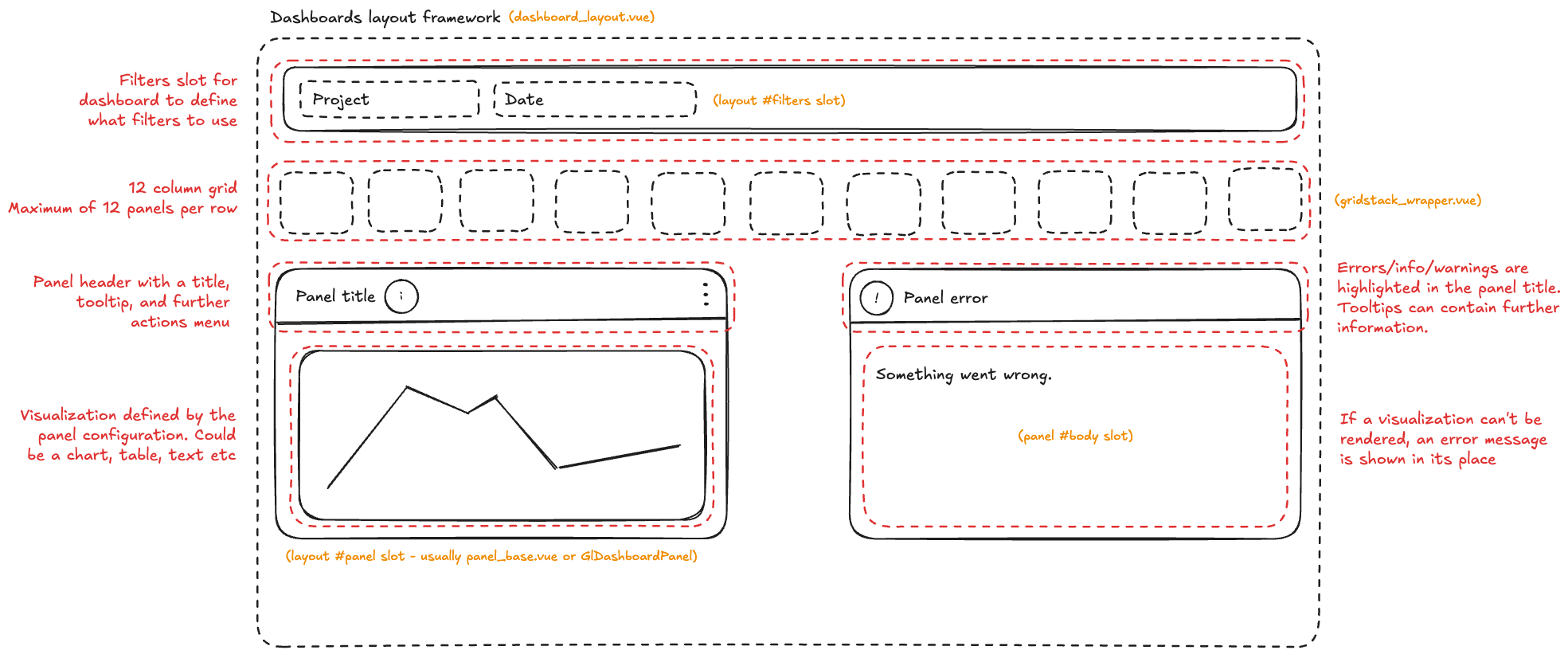
Dashboard layout
The dashboard layout component provides a structured, opinionated foundation for the dashboard experience, following a convention over configuration approach to ensure UI consistency across GitLab. While the layout enforces strict conventions for positioning, spacing, and visual hierarchy, its content remains fully configurable, allowing feature teams and users to define their own grid layout and panel contents within the stuctured framework. This design philosophy enables rapid dashboard development while maintaining a cohesive user experience throughout the platform.
The grid
In line with our design definition of a Grid, we require a cross-browser system of rows and columns to snap panels into position. Panels must be able to be resized and repositioned in a deterministic and user friendly way.
The grid itself will support 12 columns, with an unlimited number of rows. Grid panels can be up to 12 columns wide, allowing 1–12 panels per row. The height of a panel can be between 1 row and unlimited, enabling it to span any number of rows as needed.
The minimum height of each panel in the grid allows for padding, a title, and basic content.
At the medium breakpoint, the grid must collapse down to a singular column. This will move every panel to a fully vertical layout. Dropping down to a singular column will give the content of each panel the space it needs to render without looking cramped on the page of smaller viewports.
When a grid has no panels it should render an empty state.
Our preferred choice for this grid is to use Gridstack, an open-source MIT licensed library which supports grid structures, along with the changing and resizing of grid items, in a deterministic, and cross-browser friendly way.
The framework configuration must not tie directly to Gridstack in case we need to move to alternatives in future. Any grid configuration options to be abstracted to make it easier to migrate if required.
Panels
Panels are the wrapping modular container that provides a contextual interface for users to interact with their data. Each panel contains:
- A title
- A tooltip for further tertiary information (optional)
- A kebab menu of contextual actions (optional)
- An indicator for any contextual errors/warnings/info (optional)
- A loading state whilst the panel retrieves the visualization data (optional)
- The content area
Each panel can be resized in accordance with the grid and are scrollable when the content exceeds the size of the panel.
Visualizations
Visualizations refer to any component that renders a graphical representation of the data. The dashboard layout framework is agnostic to the content of the visualization, and how the visualization retrieves and processes the data.
Some common examples include:
- ECharts-based visualizations, using the GitLab UI implementations
- Visualizations may contain axis, legends, and other clickable elements depending upon the ECharts implementation.
- Tables, using GitLab UI (or the lite version)
- Visualizations may contain keyset pagination, sorting, and internal searching.
- Text or markdown-based content.
Filters
Although filtering as a concept is still under heavy UX exploration, its basic implementation is supported and consumers of the framework can make use of filter slots within the dashboard layout and panel components. While the framework provides slots to place filters in, it is up to the engineer to make sure that filters and their state changes are applied to the applicable panels and visualizations.
There are two types and levels of filters:
- Dashboard: Global filters that apply to every panel and visualization within the dashboard. In the event that a filter does not work with a visualization, then the user needs to be notified through the UI. How this notification looks is still being discussed.
- Panel: Per-panel filters used to refine the results within the dashboard context. These filters must respect and operate within the constraints set by dashboard-level filters. For example, if a dashboard-level filter limits data to the last 7 days, panel-level filters should not allow users to select date ranges outside of this boundary. If a panel is limited to a particular filter range, for instance a panel which can only show a visualization of data over the past 24 hours, then the panel must visually indicate to the user and explain the restricted.
Dashboard users may find it useful to bookmark filters. To support this engineers should sync filter with the URL and can use the UrlSync component.
Error handling
In the event of an error, the UI should display a useful error message and include corrective steps where available. When possible, errors should provide a retry button, or another next-step for users.
Page-level errors should use the Pajama’s alert component.
The errors should be located where the error occurred:
- Entire dashboard - replace dashboard grid with the error message.
- Global filters - show above the global filters unless the filter selection causes a specific error for a panel, in which case the error will appear within the panel error state.
For per-panel filters and panel-specific errors, we should use the panel error state. The panel error state will:
- Highlight the panel has an error through color and iconography.
- Have a tooltip explaining the error in detail, and what the user can do, with a retry button where applicable.
- Replace the panel content with a contextual error message.
Getting started
See the development documentation.
Migrating existing dashboards
See the development documentation.
3643eb9e)
