Partner Microsites
The Digital Experience team has integrated the ability to create customer-facing microsites within our CMS that can be utilized by our business partners. Previously, these were built in a third-party platform. By building out these solutions in-house, we are now able to give our partners a web experience to use that is on brand, specially curated, and formatted with the best user experience for high conversion in mind.
Editors can easily rearrange a specific set of components inside Contentful CMS through a drag-and-drop interface to allow for flexibilty of how the content is shown. They can also re-use content across these web experiences, which brings in a huge efficiency boost and allows for these microsites to be built faster. In addition to those key features, these pages have been built behind-the-scenes to include proper analytics and UTM tracking which contain business-critical data on how these pages are being used and can tell us an accurate story on how some page visitors become paid customers.
How does Contentful work?
If you haven’t already read it, please check out our Contentful Guide.
How to create or edit a partner microsite
For our Buyer Experience/marketing site, creating or updating a Partner Microsite requires the use of the ⭐ Partner Microsite Content Type.
Each entry in this Content Type functions as a distinct page on the site, complete with its Metadata configuration, Routing configuration, Navigation configuration, and designating which tracks, or sections, will build out the page.
SEO configuration
To configure SEO metadata attributes of a ⭐ Partner Microsite, it’s necessary to create a reference entry using the SEO Content Type.
At the very minimum, the Title, Description, ogTitle, and ogDescription should be given a value. These are critical metadata fields that will show up in search engine results along with the meta-tags of the webpage.
By default, these pages will be crawlable by search engine webcrawlers. This allows for the page to be used in search engine results. If you would like to turn this off for a specific page, you can locate the No Index toggle and switch it to true.
Routing configuration
To configure the page’s routing, it is essential to declare the slug field. A slug is the part of a URL that identifies a particular page on a website in an easy-to-read form.
All microsites will live at https://about.gitlab.com/partner/. The slug you enter determines the URL piece after that.
Ex: Entering Gantek in the slug field will designate https://about.gitlab.com/partner/gantek as the URL of the microsite page.
Partner configuration
Some of the fields that need to be configured are partner-related. Entering values in the Partner Name and Partner ID are required and that information will be used across the page for analytics and tracking purposes.
In addition, you can add a Partner Logo here. You are able to upload it directly into Contentful or reuse a logo if it has already been added to the Asset Library. A partner logo will appear in two spots on the page: the top navigation and the footer call-to-action sections. If a logo is not added, only the GitLab logo will appear.
Visual Representation

Note: Because the partner ID is listed here, the correct ID and coinciding UTM/GLM parameter name will be appended to links across the page. You will not have to enter this information on URLs entered within page buttons, which allows for these pieces of content to be reusable across different partner pages. These parameters will NOT be appended to links created in Markdown (ex: [My url text](www.externalwebsite.com)), which would occur in the Header, Subheader, Text content type.
Heading configuration
This field adds the H1, or Heading 1, to the page. This text should be the overall heading of the page. If you think of content like a hierarchy of importance, text should be a short and sweet summary of the content that the visitor will read. It is best practice to add a value here, as it has a large negative impact on SEO if it is missing (More on H1 tags here).
Top navigation configuration
The Navigation CTA Text and Navigation CTA Link are used to add a link to the top navigation. The top navigation consists of the GitLab logo, the Partner logo (if added) and this call-to-action button. If the Navigation CTA text is not entered, the button will not render.
Note: For links to an email address, you must add mailto: before the email address value. Ex: mailto:myemail@test.com. This applies to any other button on the page. In Markdown, that would look like [Contact us](mailto:myemail@test.com).
Visual Representation

Side menu configuration
The side navigation block allows you to add two content blocks: Tab Controls Container and Side Navigation. These content types are used throughout our marketing site. Because of that, these blocks are created to work in differing page types and may contain fields that are not relevant to the microsite pages.
Contentful will allow you to add more than one of each, but this may result in the page breaking. Please only add one of each (the tab controls is optional). You can also re-use existing blocks that you may have built for other microsite pages.
The following tables contain fields necessary to build out the side navigation blocks. It leaves out fields that are not used. If you enter values in the un-used fields, you will not see any changes related to them.
Tabs configuration
| Tab Controls Container | Description | Example Value |
|---|---|---|
| Internal name | This field does not appear on the page, but is used for internal purposes such as search. | “Microsite - SaaS + Self-Managed CTA Tabs” |
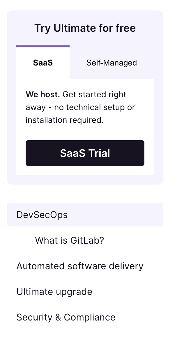
| Header | Appears above the tabs | “Try Ultimate for free” |
| Tabs | These are the individual tab blocks that build up the tab controls container. They have their own set of fields. | This takes in the Tab Control block |
| Tab Controls | Description | Example Value |
|---|---|---|
| Internal name | This field does not appear on the page, but is used for internal purposes such as search. | “SaaS tab” |
| Tab ID | Required for the tabs to work correctly and keep them accessible. Must be unique and lowercase. You can keep this value simple. | “saas” |
| Tab Button Text | The text that appears on the tab. Because of room constraints, try to keep this value short. | “GitLab.com” |
| Tab CTA | This will take in a Button content type. This is optional. | This takes in the Button block |
| Tab Panel Content | This will present you with multiple options, but at this time, you can only use the Text block. Nothing else will work for these pages. | Use the Text block here |
| Button | Description | Example Value |
|---|---|---|
| Internal name | This field does not appear on the page, but is used for internal purposes such as search. | “Microsite - SaaS Trial CTA” |
| Text | Button text | “GitLab.com trial” |
| External URL | The url that you want to take page visitors to. Remember that the utm_partnerid will be appended automatically, so no need to add that here! You may have other utm parameters you wish to add here, though. |
“https://gitlab.com/-/trial_registrations/new" |
| Data GA name | This is used for Google Analytics. You may enter a value here (the best practice is the name of the button text, but in all lowercase). However, if a value is not entered, there is logic behind-the-scenes to create these values in Google Analytics automatically! | “gitlab.com trial” |
| Data GA location | his is used for Google Analytics. You may enter a value here (the best practice is the location of the button, but in all lowercase). However, if a value is not entered, there is logic behind-the-scenes to create these values in Google Analytics automatically! | “side menu - saas tab” |
| Text | Description | Example Value |
|---|---|---|
| Text | This is in Markdown. You can use Markdown syntax or the field’s text formatter here. | “__We host.__ Get started right away - no technical setup or installation required.” |
Side navigation configuration
| Side navigation | Description | Example Value |
|---|---|---|
| Internal name | This field does not appear on the page, but is used for internal purposes such as search. | “Microsite - side nav” |
| Anchors | This takes in Anchor Link blocks. The ones entered here will be at the first level of nesting in the side navigation. | Use the Anchor Link block here |
| Anchor link | Description | Example Value |
|---|---|---|
| Internal name | This field does not appear on the page, but is used for internal purposes such as search. | “Microsite - DevSecOps” |
| Link Text | The text used for the link. | “DevSecOps” |
| Anchor Link | No external link should be added here. The anchor link MUST include a # before the text, should be lowercase, and all words must be separated by -. This should match up with an Anchor ID value you enter in the track content. Please make sure you test these links before publishing the page. |
“#devsecops” |
| Child Anchor Links | You can add a new ‘Anchor Link’ content entry here. Please note that our side navigation component only renders one level of child links. | Use the Anchor Link block here |
| Nodes (DEPRECATED) | This is an older, more complicated way of adding child links. See the new Child Anchor Links field. These are optional, but allow for a second level of nesting in the side menu. (Ex: if you want to link to sections within the DevSecOps track). At this time, this only takes in JSON data. We are working to make this easier to use. |
See below for code snippet. (Consider copy/pasting this and editing to your needs) |
| Data GA name | This is used for Google Analytics. You may enter a value here (the best practice is the name of the button text, but in all lowercase). However, if a value is not entered, there is logic behind-the-scenes to create these values in Google Analytics automatically! | “what-is-gitlab” |
| Data GA location | his is used for Google Analytics. You may enter a value here (the best practice is the location of the button, but in all lowercase). However, if a value is not entered, there is logic behind-the-scenes to create these values in Google Analytics automatically! | “side menu” |
Expand to view Nodes code snippet
Note: This method is being deprecated. Please use the Child Anchor Links field instead!
{
    "nodes": [
        {
            "href": "#what-is-gitlab",
            "text": "What is GitLab?"
        },
        {
            "href": "#your-link-here",
            "text": "Your Text Here"
        }
    ]
}
Visual Representation
Expand to view screenshot
Footer CTA configuration
The Footer CTA looks similar to the footer CTAs across our site (also known as “Next Steps”). The partner microsite template uses a page-specific footer CTA content type, ⭐ Partner Microsite - Footer CTA because this design slightly strays away from the other variants across our site.
If you have entered an image in the Microsite entry’s Partner Logo field, it will also show up in this section. You will not see this within the Footer CTA entry in the CMS.
| Footer CTA | Description | Example Value |
|---|---|---|
| Internal name | This field does not appear on the page, but is used for internal purposes such as search. | “Microsite - Basic Footer CTA” |
| Heading | The main, large text of the section | “Ready to get started?” |
| Tagline | The subtext shown under the heading. | “See what your team could do with GitLab, the most comprehensive AI-powered DevSecOps platform.” |
| Left Column CTA text (optional) | The footer section is divided into two columns. This line acts as a header for the left column. | “Try Ultimate for free” |
| Left Column Buttons (optional) | You can leave this empty or have up to two buttons. | Add a Button entry here |
| Right Column Taglines (optional) | You can leave this empty or have up to two taglines here. This takes in a Header and Text content entry | Add a Header and Text content entry here |
Visual Representation
Expand to view screenshot

Microsite track/section configuration
The ⭐ Partner Microsite takes in individual sections, or tracks, containing content. These blocks are a content type called ⭐ Partner Microsite - Track. By splitting the page up into these tracks you can easily reuse them across different partner pages. In addition, the page’s logic knows to add some spacing in between these sections to visually break them up.
The content type takes in an Internal ID and a series of available content blocks. The following content blocks are available within a Track at this time: Header, Subheader, and Text, External Video, Card Group, and Card.
Header, Subheader, and Text
You can use this content type’s fields interchangeably, meaning you don’t always need to use the header or text. This is useful for when you want to create a large block of text, then add a video or card group in the middle, and want to continue with text just below it.
| Header, Subheader, and Text | Description | Example Value |
|---|---|---|
| Internal name | This field does not appear on the page, but is used for internal purposes such as search. | “Microsite - Built-in Security” |
| Anchor ID (optional) | This can be used in tandem with the side navigation links. The value should NOT contain a # symbol. The value should match with the side navigation link value. |
“security-and-compliance” |
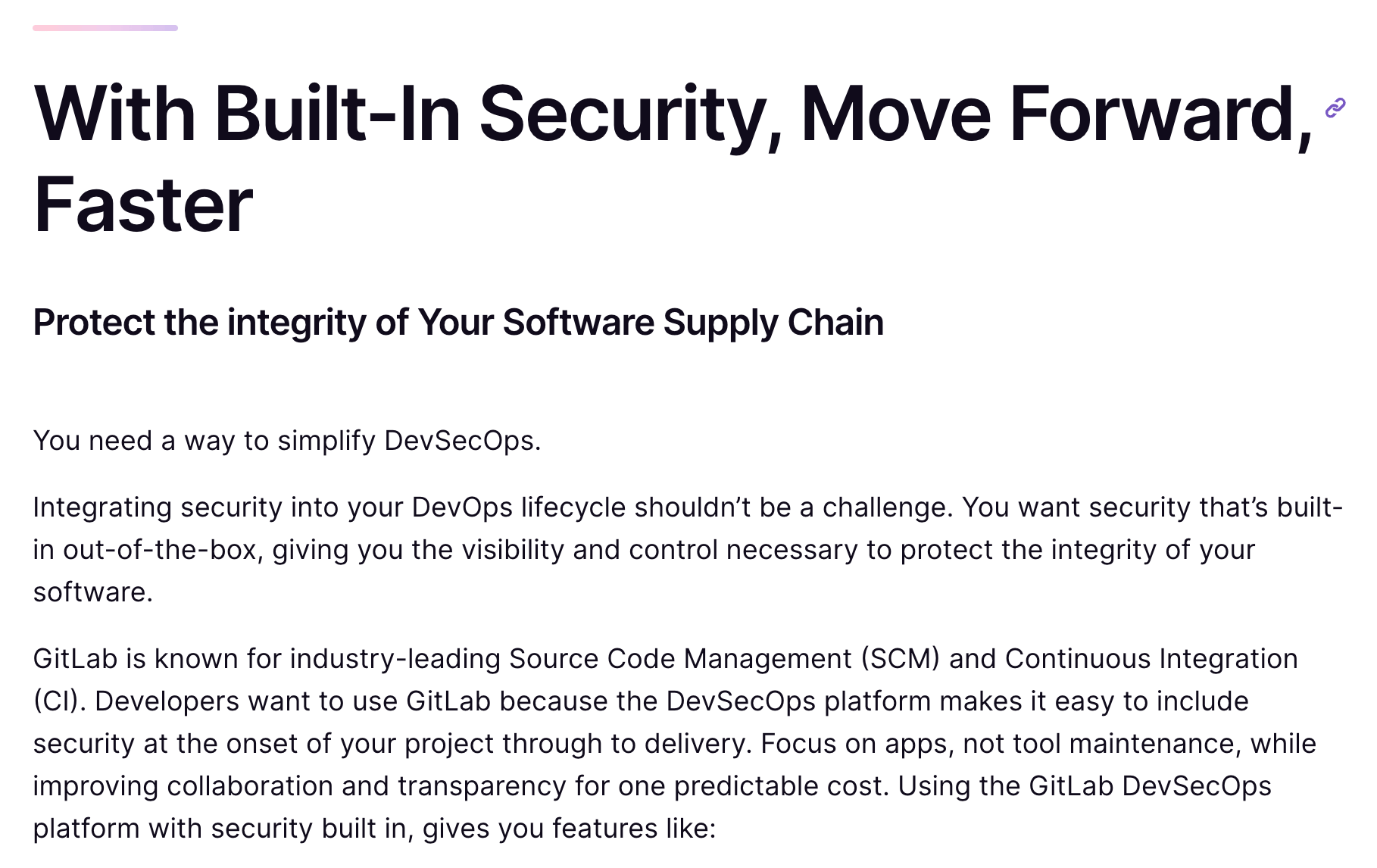
| Header (optional) | If you would like to use a header, the value would go here. | “With Built-in Security, Move Forward, Faster” |
| Subheader (optional) | If you would like to use a subheader, the value would go here. | “Protect the integrity of Your Software Supply Chain” |
| Text (optional) | If you would like to add text, you can add long blocks of text here. You can use this content block for just a block of text with no headers. | Long-form, formatted text can go here. |
Visual Representation
Expand to view screenshot
Example of continued text
External Video
It is best practice for videos to be uploaded to Vimeo, however our Video content type allows Youtube video URLs. If you need a video uploaded to one of these platforms, please reach out to the Brand/Video team. We do not directly upload videos to the CMS.
You can find the embed URL of the video by going to that platform’s Share button, look for something that mentions Embed, and copy the URL (not the whole chunk of code) that it gives you.
| External Video | Description | Example Value |
|---|---|---|
| External video | Title of the video, used for internal search | “What is GitLab?” |
| Title | Used in the iFrame that the video renders in. Useful for accessibility purposes. | “What is GitLab?” |
| URL | The embed URL of the Youtube or Vimeo video. | “https://player.vimeo.com/video/799236905?h=4eee39a447&badge=0&autopause=0&player_id=0&app_id=58479" |
| Anchor ID (optional) | To be used in tandem with the side navigation. Some videos could be used as standalone content in their track. This allows a page visitor to easily scroll to them. | “what-is-gitlab” |
Visual Representation
Expand to view screenshot

Card Group
The card group should be used when two or more cards should be blocked together. There are two different types of configurations that will work at this time.
You will configure the card group as normal, but the way you configure the individual Card will differ.
| Card Group | Description | Example Value |
|---|---|---|
| Internal name | This field does not appear on the page, but is used for internal purposes such as search. | “Microsite - DevSecOps Cards” |
| Cards | This will reference Card entries. | Add existing, or create new Card entries |
Header and text variation
| Card Group -> Card - Header and Text | Description | Example Value |
|---|---|---|
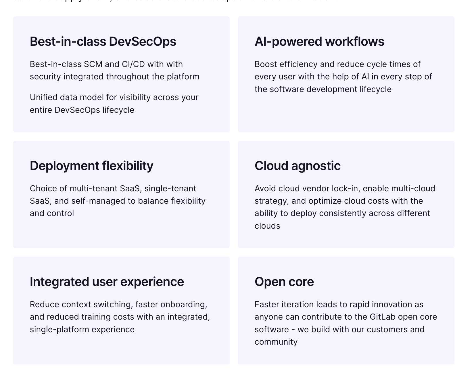
| Internal name | This field does not appear on the page, but is used for internal purposes such as search. | “Microsite - Best-in-class DevSecOps” |
| Title | Main heading of card | “Best-in-class DevSecOps” |
| Description | Text block within the card | Use Markdown / the text editor to add a formatted text block here |
Visual representation
Expand to view screenshot
Icon and header variation
If no text is entered, there is code in place to make the heading font a little bigger in order to look nicer. This is paired with an icon of your choice.
At this time, our icons render depending on the icon name that you enter in the field. Our icon library lives in our design system, Slippers. When you access this link, there is a dropdown called Icon on the left. This contains our current icon library. You can view the icon once you select it from the dropdown. When you find an icon you want to use, type in that name **minus the “slp-” in the “Icon” field in the CMS. Ex: “slp-digital-transformation” should be “digital-transformation”.
We are actively working on a solution to make the icon selection experience much easier!
| Card Group -> Card - Icon and header | Description | Example Value |
|---|---|---|
| Internal name | This field does not appear on the page, but is used for internal purposes such as search. | “Microsite - Best-in-class DevSecOps” |
| Title | Main heading of card | “Best-in-class DevSecOps” |
| Icon Name | See notes above. This should be an icon found in Slippers. Do not enter the “slp-” portion of the icon name. | “speed-alt-2” |
Visual representation
Expand to view screenshot
Card
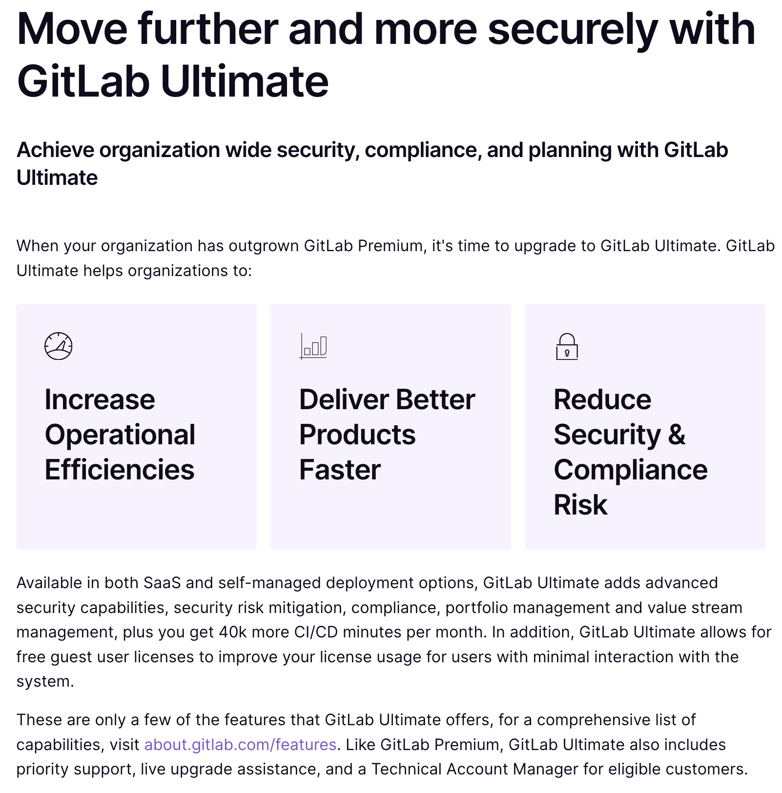
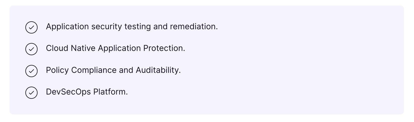
The card is the same that is used within the Card Group, except the visual representation is different. A Card used outside of a Card Group will be a standalone section of content with a colored background. It can be helpful to think of this content block to “showcase” an important list.
At this time, these call-out sections take in a list of information. The checkmark icon is automatically pre-pended for each list item.
| Card | Description | Example Value |
|---|---|---|
| Internal name | This field does not appear on the page, but is used for internal purposes such as search. | “Microsite - automated software delivery card” |
| List | For each list item, type in the sentence and press ENTER |
[ “Integrate security across the entire DevOps lifecycle”, “Improve collaboration across development, security and operations teams”, “Speed up their cloud-native, hybrid, and multi-cloud adoption” |
Visual representation
Expand to view screenshot
Useful editing tips and tricks
-
Contentful’s key feature is that it allows you to reuse content. Create once, use everywhere! You can look on the right side of an entry under
Linksto see where the entry is being used. If you make an update to a shared entry, it will update everywhere. This is good or bad depending on your intentions! If you want to make an update but not have it be reflected everywhere, it may mean that a new entry of some type is warranted. -
We have functionality on these partner pages that auto-appends the partner ID to links. This does NOT work for links created in Markdown. You will have to add these in yourself to ensure proper Google Analytics tracking. That format looks like
[link name](https://www.link.com){data-ga-name="your value in lowercase goes here" data-ga-location="body"} -
Some resources, like videos, may already be added to Contentful. Before adding new content, search around and see if you can reuse something already available.
-
It is better practice for a track to start off with the Header, Subheader, and Text or External Video content block, as they can contain an Anchor ID. A Card Group or standalone Card will visually fit better between text blocks or directly below a text block.
Video demo and overview
4e6ac4e3)
