Contentful CMS Custom Pages
Custom Pages
The Digital Experience team has successfully integrated an exceptional feature that empowers content editors to effortlessly construct pages for the Marketing Site. This innovative functionality leverages a collection of user-friendly custom components, providing a seamless page-building experience. Editors can easily rearrange these components through a simple drag-and-drop interface inside Contentful CMS, enhancing flexibility and efficiency in content creation.
How does Contentful work?
If you haven’t already read it, please check out our Contentful Guide.
How to Edit/Create pages using “Custom Pages”
For our Buyer Experience Site, creating or updating a Custom Page requires the use of the 🛠️ Custom Page Content Type. Each entry in this Content Type functions as a distinct page on the site, complete with its Metadata configuration, Routing configuration, Hero configuration and Dynamic Components configuration.
Routing configuration
To configure the page’s routing, it is essential to declare the slug field. The page routes can extend up to three levels, for example, /level-1/level-2/level-3/.
It is crucial to include both a trailing slash and a leading slash to ensure proper functionality within Buyer Experience.
Hero Configuration
To personalize the hero section, use the fields in the 🛠️ Custom Page Content Type. These fields are designed to let you customize the static Hero section, making it the first component that visitors see on the page.
| Custom Page Field | Description | Example Value |
|---|---|---|
| Header | Main header of the Hero | “Custom page header” |
| Subheader | Subheader of the Hero | “Custom page subheader” |
| Description | Long text section of the Hero | “Custom page description. Lorem ipsum dolor sit amet, consectetur adipiscing elit, sed do eiusmod tempor incididunt ut labore et dolore magna aliqua. Ut enim ad minim veniam, quis nostrud exercitation ullamco laboris nisi ut aliquip ex ea commodo consequat” |
| Primary CTA Link | Redirection link for the primary button | /primary-link/ |
| Primary CTA Text | Text inside the primary button | “Primary Link” |
| Secondary CTA Link | Redirection link for the secondary button | /secondary-link/ |
| Secondary CTA Text | Text inside the secondary button | “Secondary Link” |
Visual Representation

Metadata Configuration
To configure SEO metadata attributes of a 🛠️ Custom Page, it’s necessary to create a reference entry using the SEO Content Type.
Side Navigation
Within the 🛠️ Custom Page Content Type, you’ll find a field named Activate Side Menu. Enabling this option activates the side navigation for the page. The side navigation is dynamically generated, considering the Header field of each component used.
Available Dynamic Components
The list below includes all available Content Types that can be utilized in the components field, each accompanied by its visual representation. This field allows content editors to effortlessly reorder the page through a simple drag-and-drop action.
🛠️ Text Block
Enhance your content with the 🛠️ Text Block content type. This versatile option empowers content editors to establish a fundamental header and a markdown text section. Additionally, it offers the flexibility to seamlessly incorporate a CTA, images and videos into your content.
| Text Block Field | Description | Example Value |
|---|---|---|
| Internal Name | Name to find the entry within Contentful | N/A |
| Header | Header of the block, if used with the side navigation, this text will be used as anchor | “Text block header” |
| Text | Markdown text block | “About GitLab GitLab is the most comprehensive AI-powered DevSecOps platform for software innovation. GitLab enables organizations to increase developer productivity, improve operational efficiency, reduce security and compliance risk, and accelerate digital transformation. More than 30 million registered users and more than 50% of the Fortune 100 trust GitLab to ship better, more secure software faster.” |
| CTA Text | CTA button text | “Text Block CTA” |
| CTA Url | CTA button redirection link | /text-block/ |
| Image | Optional image from Contentful | N/A |
| Video URL | Optional external video URL (Youtube, Vimeo) | https://www.youtube.com/embed/8aV5AxJrHDg?si=l1vgM17YlRJHC8T2 |
Visual Representation

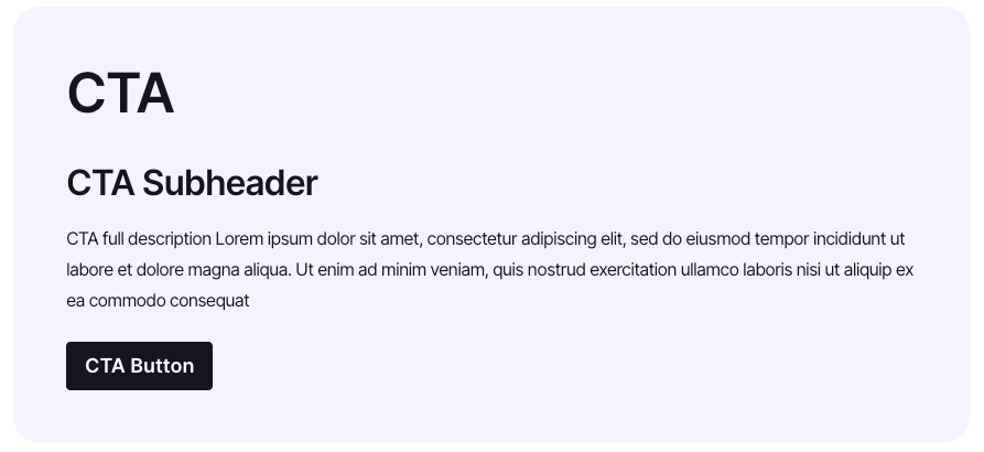
🛠️ CTA
The 🛠️ CTA Content Type represents a Call-to-Action card component featuring a CTA button and various text fields.
| CTA Field | Description | Example Value |
|---|---|---|
| Internal Name | Name to find the entry within Contentful | N/A |
| Header | Header of the block, if used with the side navigation, this text will be used as anchor | “CTA” |
| Subheader | Subtitle of the CTA card | “CTA Subheader” |
| Description | Long text inside the CTA card | “CTA full description Lorem ipsum dolor sit amet, consectetur adipiscing elit, sed do eiusmod tempor incididunt ut labore et dolore magna aliqua. Ut enim ad minim veniam, quis nostrud exercitation ullamco laboris nisi ut aliquip ex ea commodo consequat” |
| Button Text | CTA button text | “CTA Button” |
| Button URL | CTA button redirection URL | /cta-button/ |
Visual Representation

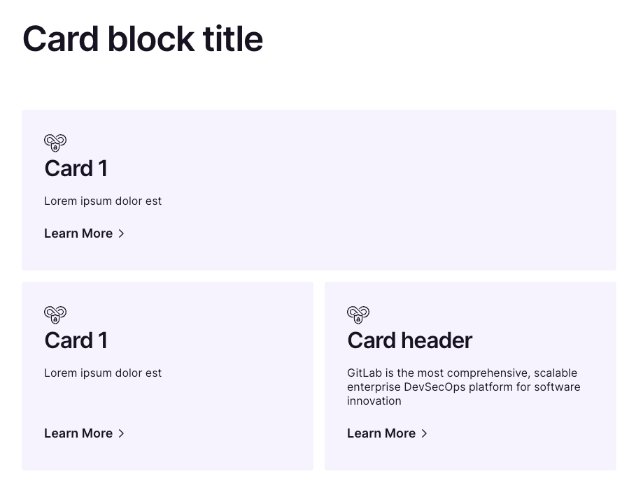
🛠️ Card Block and 🛠️ Card Block: Card
The 🛠️ Card Block and 🛠️ Card-Block: Card are two Content Types designed to complement each other. 🛠️ Card Block serves as the section container, housing a list of references to individual 🛠️ Card Block: Card items.
| Card Block Fields | Description | Example Value |
|---|---|---|
| Internal Name | Name to find the entry within Contentful | N/A |
| Header | Header of the block, if used with the side navigation, this text will be used as anchor | “Card block title” |
| Cards | A reference list of “Card Block: Card” entries | 3 card entries |
| Card Block: Card Fields | Description | Example Value |
|---|---|---|
| Header | Title of a card | Card 1 |
| Description | Long text inside the card | Lorem ipsum dolor est |
| Link | Card redirection URL | /card-1/ |
| Icon | Icon name for the card, the list of icons can be found in Slippers | devsecops |
Visual Representation

🛠️ Landing Grid and 🛠️ Landing grid Card
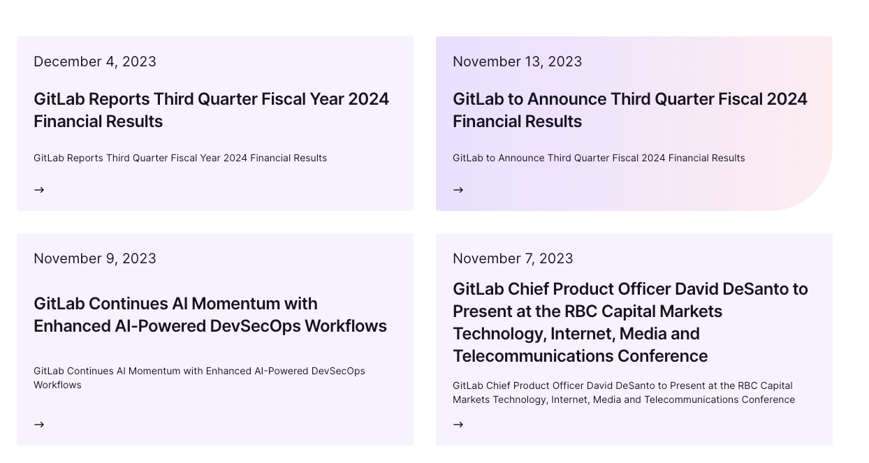
The 🛠️ Landing Grid is a valuable Content Type designed for Landing Pages. When utilizing this Content Type, cards are dynamically generated based on the child pages associated with the landing page. For instance, if there is a /solutions landing page, all child pages under /solutions/* will be automatically listed without requiring manual manipulation.
| Landing Grid Fields | Description | Example Value |
|---|---|---|
| Internal Name | Name to find the entry within Contentful | N/A |
| Number of Columns | Tells the grid how many cards per row should show | 2 |
| Cards | List of landing grid cards to be used instead of the automatic card generation the component provides | N/A |
If the landing page needs to render specific cards that are not children to the current URL, the card field can be filled with the cards that need to be displayed, this field takes Landing grid Card components which have the following fields:
| Landing Grid Card Fields | Description | Example Value |
|---|---|---|
| Internal Name | Name to find the entry within Contentful | N/A |
| Header | Card header | Card 1 |
| Date | Date to display in the card (The cards will be ordered based on this value, display the most recent at the top) | 12 Dec 2023 |
| Description | Short text to include in the card | Lorem ipsum dolor est |
| Link | Card redirection URL | /card-1/ |

🛠️ Marketo Form
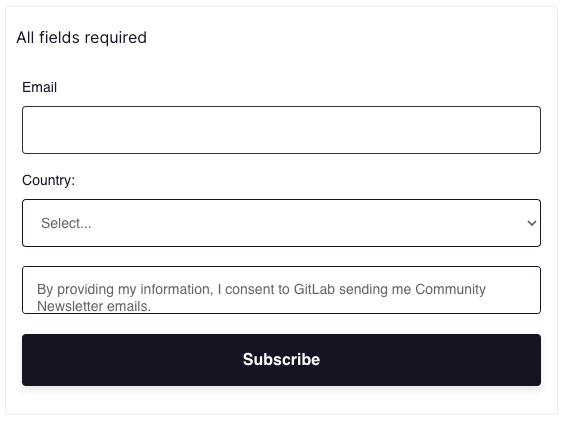
The 🛠️ Marketo Form allows users to place a form on the page.
| Marketo Form Fields | Description | Example Value |
|---|---|---|
| Internal Name | Name to find the entry within Contentful | N/A |
| Form Id | Marketo Form ID - the meats and potatoes of this component | 4011 |
| Form Data Layer | ? | |
| Form Header | H2 Form Header | Community Newsletter |
| Confirmation Message Title | Title of the form subitted message | Submission received! |
| Confirmation Message | Displays once the form is submited | We will be in contact shortly. |
| Error Message | Message the displays when there is a error with the form | Sorry! Something went wrong. |
| Required Fields Message | Message the displays in small italic text communicating requried fields | All fields required |
Visual Representation

Video Walkthrough of building a page
As an example, we built a community page from scratch in the following video.
61f97a04)
